User blog:ToaMeiko/A look at the upcoming version of Refreshed

From Brickipedia, the LEGO Wiki
7

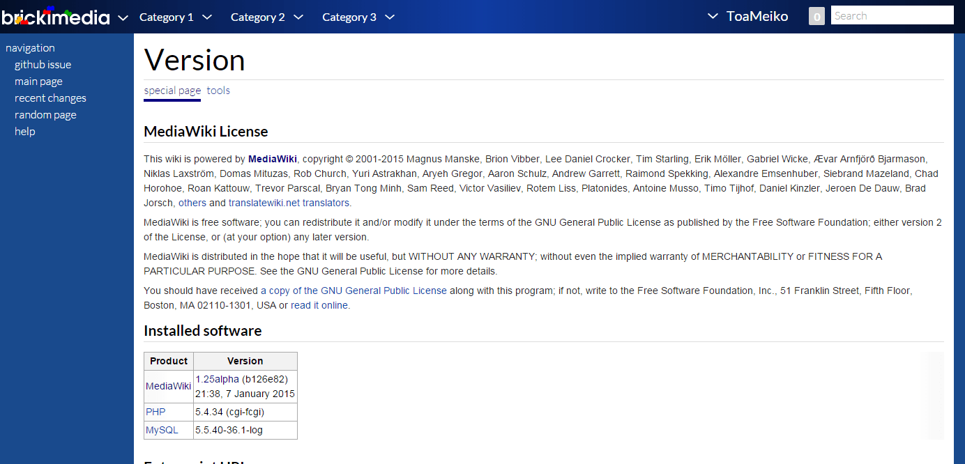
Hi everyone! Many of you know the Refreshed skin here at Brickimedia, as it's currently the default skin for all users and readers. Over the course of the past 9 months, several Brickimedians have been hard at work redesigning the Refreshed skin based on various problems and difficulties the current version has. This redesign takes into concern many complaints received about the original design of Refreshed as well as some basic usability improvements to make the skin much more functional across any device. Here is a look at the upcoming Refreshed version 3.0:

Refreshed3screen1.png

New features and changes[edit source]

This new version comes with many changes, improvements, and new features. To outline some of them:

Header categories[edit source]

Refreshed3screen2.PNG


Header categories provide customizable and unlimited navigation additions to the skin. There is no limit to how many categories can be added nor to how many entries below the category. This will allow for customizable navigation on each wiki to make browsing much simpler and providing the opportunity to highlight popular pages. Header categories can be set at MediaWiki:refreshed-navigation by any wiki administrators.

Sidebars[edit source]

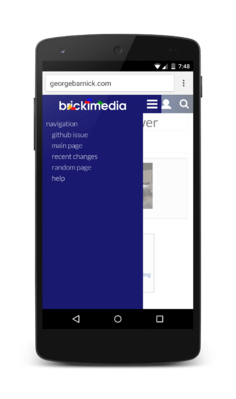
There is now only one sidebar to have to keep track of. The page actions that were once found in the sidebar can now be found under the title of the page and fixate as you scroll to easily access editing tools when reading an article.

Mobile[edit source]

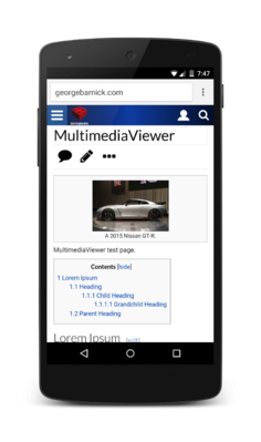
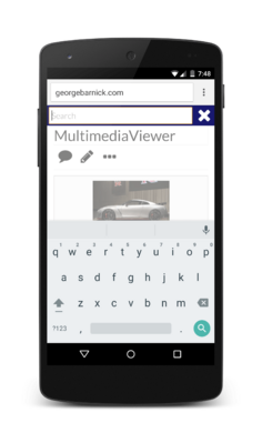
Many design and functionality changes have been made to the mobile skin for Refreshed 3.0. Here are a few highlights:

Other changes[edit source]

  • CSS is now simpler to customize. Further simplification is planned for upcoming releases.
  • Page loads are now faster with a less-cluttered skin.
  • Refreshed now has better support for various MediaWiki extensions.
  • Refreshed 3.0 will support page status indicators, a MediaWiki feature being introduced in MediaWiki 1.25.
  • Tablets now have a faster search capability through the header.
  • Special:Search is fixed for all layouts (desktop, tablet and mobile) and has an improved mobile layout for small screens.
  • Article Table Of Contents (TOC) is now located within the content of the article rather than the article. This fixes some usability issues with the current TOC and allows for use of the TOC on mobile.
  • Refreshed has received a minor typography refresh to improve font readability on articles.
  • Echo Notifications are now built into the skin. This allows for better notification functionality as well as notifications enabled on mobile devices.
  • MultimediaViewer functionality and display is improved in Refreshed 3.0.
  • Most text overflow issues on small resolutions are fixed.

There are always new features being tested and added. Some you may see in the near future include:

  • VisualEditor support.
  • Better anonymous user tools. Instead of showing the IP address in the header with a dropdown, the header will provide Log in and sign up links.

And of course, I can't take all the credit for this. So much work was put in by a group of various talented designers and developers. I'd especially like to thank:

  • UltrasonicNXT for designing the original Refreshed skin and contributing on its redesign for version 3.0.
  • MtMNC for doing an exceptional job assisting in design and writing many new features and improvements for the skin. Much of the work on Refreshed's mobile layout was done by him.
  • Jack Phoenix from ShoutWiki, for contributing many PHP changes to the skin and for writing the original code that Refreshed's Header Categories were adapted from.
  • Seaside98 from the LEGO Message Boards Wiki, for providing advice throughout the design stages of the new version and for contributing with useful CSS tweaks.
  • The MediaWiki design team for help and feedback on skin design and functionality.
  • And everyone else who provided insight, advice, suggestions, criticisms and coding assistance on the new version!

Refreshed version 3.0 will be rolling out to Brickimedia wikis in the coming days. If you have any questions, comments, or feedback, please leave them in the comments below. Thanks!

Comments (28)[edit source]

Add your comment
Brickipedia welcomes all comments. If you do not want to be anonymous, register or log in. It is free.


avatar

Batgirl78Novice

120 months ago
Score 0++
It looks very well throughout. I'm looking forward to it. :3
avatar

Miku HatsuneNovice

120 months ago
Score 2++
refreshed is so much sexier than oasis :p
avatar

Bricki-LachlanBricktastic

120 months ago
Score 0++
I had nothing against the original but I like the changes. One suggestion - could you make all the input boxes on mobile have a larger font size? I'm using an iPod Touch 4 running iOS 6 and editing is impossible due to the browser zooming in. I think Android behaves the same way but I'll test it when my new phone comes.
avatar

Brikkyy13Outstanding Brickipedian

120 months ago
Score 2++
Under the current themes tab the only thing showing is Ninjago Is that getting fixed or have we just disregarded all the other themes? :P
avatar

ToaMeikoHonorable Brickipedian

120 months ago
Score 0++
It's cached. It's already been changed on MediaWiki:Refreshed-navigation.
avatar

NovaHawkLegendary Brickipedian

120 months ago
Score 0++
Must be a very long time on the cache- it's been like 24 hrs already :P
avatar

ToaMeikoHonorable Brickipedian

120 months ago
Score 1++
There, went ahead and restarted memcached to force it to update (very dirty way of doing it and will make pages load slower for a bit while the cache regens, but faster than waiting for it to update itself).
avatar

NovaHawkLegendary Brickipedian

120 months ago
Score 0++
Any idea why it's only going up to The LEGO Movie?
avatar

ToaMeikoHonorable Brickipedian

120 months ago
Score 1++
I'll have to double check the code. Looks like it's limiting the number of entries per category to 10.
avatar

NovaHawkLegendary Brickipedian

120 months ago
Score 0++
I guess that's for compatability with smaller screens? Also, huge lists also don't look great I guess
avatar

Brikkyy13Outstanding Brickipedian

120 months ago
Score 0++
Are there still bugs? Because the page is loading in html about 25% of the time for me. Could just be me though :P
avatar

CJCBricktastic

120 months ago
Score 0++
Have you cleared the cache?
avatar

Brikkyy13Outstanding Brickipedian

120 months ago
Score 0++
Because I was in my tablet at the time I couldn't access those tools :P another issue on loading, only the first 50 lines or so were showing before only the background was shown. Again, not sure if it was just me.
avatar

ToaMeikoHonorable Brickipedian

120 months ago
Score 0++
Just hit the Refresh button or follow the instructions based on your browser at MediaWiki:Clearyourcache. Some pages will be cached and still load the old Refreshed skin's CSS and JS which isn't compatible with the new Refreshed's HTML, which is why it looks like a mess. :)
avatar

IchindarBrick Master

120 months ago
Score 1++
I like it :)
avatar

NovaHawkLegendary Brickipedian

120 months ago
Score 0++

Great to see the new skin!

Just noticed one thing though- the left sidebar is fixed, so if you have a smaller screen/window, you're not going to see everything (eg, for my normal screen size, the people on chat runs off the page). Not sure if that matters, just pointing it out.
avatar

MtMNCNovice

120 months ago
Score 0++

Glad you like the skin!

You can scroll the sidebar independently of the page.
avatar

ToaMeikoHonorable Brickipedian

120 months ago
Score 0++
It should automatically show a scroll bar for overflows. As seen on my screen when I shrink the window it has a scroll bar for the sidebar. Not the prettiest way to have it overflow but it shouldn't cut off the bottom from being able to be seen. This was the same on the older versions of Refreshed on the right-hand sidebar.
avatar

NovaHawkLegendary Brickipedian

120 months ago
Score 0++
Oh whoops, never mind, it's just my ancient browser (just tested it on Firefox and it worked fine :P). Sorry!
avatar

LEGOSuperDKongNovice

121 months ago
Score 3++
Excited for this.
avatar

LoneyNovice

121 months ago
Score 4++
This looks really great, might make me come here more often. :P
avatar

SKP4472Thinking With Bricks

121 months ago
Score 1++
This looks great. I look forward to its release. My only suggestion at the moment would be to use the full logo on the mobile layout and not just in the sidebar. Other than that you guys have done an exceptional job so well done to all those that helped make this possible. :)
avatar

ToaMeikoHonorable Brickipedian

121 months ago
Score 0++
This was a choice in the update as including a wordmark takes up a lot of space in the header. To fit the sidebar expand button, the search button, and user tools/notifications in the header, the most that can be done is a small, square logo. Otherwise it clutters the header, overflows on smaller mobile screens. The pictured screenshots are on a 1080x1920 5" screen, which is larger than most commonly-used mobile screens (slightly larger physically than the iPhone 6 but same resolution as the iPhone 6 Plus, which makes the display even more compact on an iPhone 5 or an iPhone 4). The square mobile icon you see can be changed, and isn't based on $wgLogo so there is room to change it freely, but there is much more limitation on how much can fit in the header on mobile than there is on desktop or even tablets.
avatar

AjraddatzAmateur

121 months ago
Score 2++
(:
avatar

NovaHawkLegendary Brickipedian

121 months ago
Score 6++
Great to see this is finally happening, looking forward to taking a look at it :) Unlike the original Refreshed, there's a chance it may convince me to change from Deep Sea :P
avatar

ToaMeikoHonorable Brickipedian

121 months ago
Score 1++
Once it's live on the site, if you set it as your default skin don't hesitate to give us any of your observations of things that could be improved as well as what you like about it. :)
avatar

UltrasonicNXTThinking With Bricks

121 months ago
Score 1++
Ohh pushing the boat out there Nova ;)
avatar

1999bugAmateur

121 months ago
Score 6++
The header categories will be very useful.