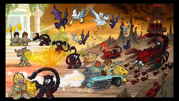
Brickipedia News:Chima concept art: bulls and lions and chi! Oh my!
| by Berrybrick July 1, 2015 |
For a theme that was intended to replace the colossal corpus that fan-favorite Ninjago has become, it doesn't seem as though Legends of Chima has amassed the same following and it seems that after a three year run, it's in the cards for Laval and his friends to be tanned, hung, and be left as trophies in the LEGO warehouse for some jittery intern to come across on a dark and stormy night. Okay, it's not that bad, of course, the sets have introduced plenty of interesting new elements and the anamorphic minifigures certainly are fun, if not different. Even if the show did become a joke among the larger community (you'd have to be smoking Chi not to see it), it did find its own faithful viewership, and for them, Chima will be missed for its fantastic world, striking inhabitants, and zany vehicles. It is not unusual for old themes to be brought back to life as their old fans grow up and become accomplished MOCists. Fabuland, which is often paralleled with Chima, is one such example, and I for one would welcome Chima if it continues to rear its head with some breathtaking animalian MOCs in the next decades.
Well, that's enough about what was, what could have been? It looks pretty great. In honor of Chima, a few weeks ago, LEGO released some concept art featuring plenty of the tribes we have gotten to know over the last few years: Lions, eagles, gorillas, wolves, crocodiles, bears, scorpions, bats, vultures, and plenty more. There are even some which never saw the light of day, such as insects, fish, snakes, and my personal favorite, bulls. Wonder Woman fans might also be disappointed to see that there seems to be a cheetah woman in one sketch. Concept art is always a treat to look at. A few years ago, some concepts for Knights' Kingdom II was discovered, and, I speak as someone who ate those sets up when I was younger, though the theme itself may not have aged well, a lot of the art is still really cool to look through, to see what the designers were considering. I have to say that this Chima art is my favorite since I discovered a cahce of old BIONICLE art hidden away at the Biomedia project (link at the end). LEGO promises that this art is "[B]oth beautiful and a bit scary. Just like seeing old pictures of yourself," and that is the perfect way to describe it. Some of the considerations are rather grotesque and malformed, but at the same time, getting an eye into the designers' original vision is spectacular and opens up new questions, new inspirations. One thing that particularly stands out to me is that many of these seem to be much more humanoid characters wearing masks, helmets, and headdresses. The only thing particularly animal about a lot of them is their skin color. One shot even shows a lion guy running towards a ledge as he puts on an eagle helmet and then transforming into one of the blue-skinned birdmen we have gotten to know over the last three years. It seems that that cloaked villain in the first image is collecting golden helmets from a fountain guarded by the lions. The golden helmets seem to grant special powers, as one of the characters, in the same image, has donned a golden lion mask and is thwarting a scorpion soldier with fiery breath. How cool is that?
Chi, of course, is still present in these images. The second one includes a pretty cool looking lion pyramid where the orbs are being collected and one of the soldiers is spotted placing it into a cavity in his chest armor, while a crocodile is stealing it from another lion. Other images show more colors of Chi than have appeared in the sets, where we only have blue, orange, and gold. Some of the warriors are wearing, yes blue and orange, but also red, green, and purple. It is not of particular importance, of course, but good to note nonetheless.
Flicking through the concepts, there are all sorts of pieces which would have been amazing to have; the lions' hairpieces, that cloaked guy's snake staff, the spotted cloak that some lions wear (Hercules, anyone?). There are also all sorts of characters which only appeared in the TV show, or not at all, and now we can see that they were considered at some point. There is even a sketch showing how they would release Cragger's dentist Plovar.
I've hardly scratched the surface of what there is to see, and whether you are a fan of Chima or not, I suggest taking a look. Here's a link. Unfortunately, it doesn't seem like the fifth chapter is working, but there is still plenty to feast your eyes on in the other four.
Oh, and in case you are interested in that BIONICLE art I mentioned, here that is. Go look at Chima first though. Chima is more important right now because I say so.
Tags: Legends of Chima


